Getting your e-commerce conversion rates up isn't about one magic fix. It’s a mix of improving the customer's journey, making checkout dead simple, and, most importantly, knowing where you stand right now. Too many store owners just look at the final sales number, but the real story is in the details—like why people are ditching their carts.
Setting the Stage for Higher Conversion Rates
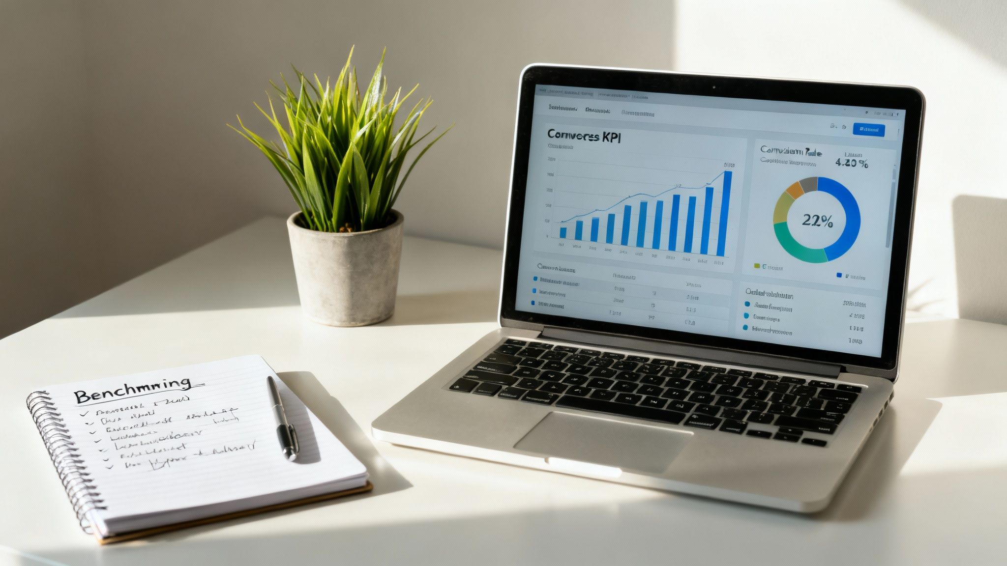
Before you start tweaking buttons and rewriting copy, you need a clear picture of your starting line. I’ve seen countless merchants chase the latest "hot tactic" without first understanding how their own store is performing.
Here’s the thing: a "good" conversion rate isn't some universal number. It's a moving target that depends entirely on your industry, what you sell, and how your customers behave. Establishing your baseline turns random shots in the dark into a data-driven mission.
Understanding Your Current Performance
Your journey starts with a brutally honest look at the key numbers that tell the real story behind your sales. Sure, the overall conversion rate is the headline, but the juicy details are buried a little deeper.
Look past the final purchase and dig into these metrics:
- Cart Abandonment Rate: What percentage of people add products to their cart but bail before paying? A high number here is a massive red flag, usually pointing to friction in your checkout.
- Average Order Value (AOV): How much does a typical customer spend in one go? Bumping this up is a fantastic way to grow revenue without needing more traffic.
- Add-to-Cart Rate: This shows how many visitors are actually interested enough to take that next step. If it's low, you might have a problem with your product pages or pricing.
By breaking these down, you can see exactly where the leaks are in your sales funnel. This lets you focus your energy and money where it will actually make a difference.
The goal isn't just to snag more sales; it's to create a path to purchase that's so smooth and intuitive, people glide right through it. Fixing the leaks is almost always more effective than just trying to pour more traffic in at the top.
Benchmarking Against Your Industry
Context is everything. A 2% conversion rate might be phenomenal for a high-end furniture store where people think for weeks before buying. But for a shop selling cheap phone cases? That same 2% could be a sign of serious trouble.
This is why industry benchmarks are so gold—they give you a realistic measuring stick.
The global average e-commerce conversion rate hovers between 2% and 4%, but that number swings wildly depending on what you're selling. Understanding where you fit in helps you set goals that are ambitious but achievable.
Ecommerce Conversion Rate Benchmarks by Industry
To give you a clearer picture, here's a quick look at how conversion rates can differ across various sectors. Use this table to see how your store stacks up against the competition and understand the typical behavior of shoppers in your niche.
| Industry | Average Conversion Rate | Key Consumer Behavior |
|---|---|---|
| Arts & Crafts | 8.0% | High-intent, passion-driven purchases. |
| Personal Care | 6.8% | Often repeat buys, driven by need and brand loyalty. |
| Food & Beverage | 5.5% | Frequent, low-cost purchases and subscriptions. |
| Fashion & Apparel | 2.5% | Heavy browsing, sensitive to trends and returns policies. |
| Home & Garden | 1.8% | Higher-cost items, longer research and comparison phase. |
As you can see, an online grocery store and a luxury watch retailer are playing completely different games. Knowing these nuances helps you apply the right strategies for your market.
Once you have this foundational knowledge, you can spot your biggest opportunities. With a solid baseline and clear industry context, you’re ready to roll out changes that will genuinely move the needle. For a deeper dive, there are plenty of proven ecommerce conversion rate optimization strategies that build on this foundation.
Crafting a User Experience That Sells
Let's be blunt: a fantastic product means absolutely nothing if your website feels like an obstacle course. Every single moment a potential customer spends trying to figure out your site is a moment they’re inching closer to the exit. To actually boost your conversion rates, you need to stop thinking of your store as a product catalog and start treating it like a guided, intuitive shopping journey.
Think of your website's user experience (UX) as your best salesperson. It works 24/7, tirelessly answering questions, guiding visitors, and making it ridiculously easy to say "yes." But if this digital salesperson is slow, confusing, or unhelpful, you're just bleeding sales. The name of the game is removing friction at every single touchpoint.
Make Navigation Effortless
Your site navigation is the map to your store. If that map is a confusing mess, shoppers will get lost and give up. It’s that simple. Simplicity is your greatest ally here; you want to slash the amount of thinking a visitor has to do to find what they're looking for.
Start by taking a hard look at your main menu. Are the categories clear and logical? Overloading your menu with a dozen options is a classic mistake that leads to decision paralysis. Stick to a handful of core categories that cover your main product lines.
- Limit your primary menu choices: For the sake of clarity, keep your main navigation to 5-7 top-level categories.
- Use descriptive labels: Ditch generic terms like "Products." Be specific with categories like "Men's Jackets" or "Kitchen Appliances."
- Implement breadcrumbs: This simple navigational aid shows users their path (e.g., Home > Men's Apparel > Outerwear), making it easy to backtrack without hammering the back button.
A well-organized navigation system doesn't just help users—it gives search engines a clear picture of your site structure, which is a nice little SEO bonus.
Supercharge Your Site Search
A huge portion of your most motivated buyers will head straight for the search bar. They know exactly what they want, and they expect you to help them find it instantly. A slow, inaccurate search function is a guaranteed way to send them packing, right into the arms of a competitor.
Your search bar should act more like a concierge than a filing cabinet, anticipating needs and offering helpful suggestions. An intelligent search feature can dramatically improve the user experience by connecting high-intent shoppers with the right products faster than they can blink.
Research shows that visitors who use site search are often 2-3 times more likely to convert. They are literally telling you what they want to buy; your only job is to show it to them.
To make your search truly effective, add features like autocomplete and autosuggest, which offer up relevant products as the user types. It's also critical to handle typos gracefully. A search for "blck t-shrt" absolutely must bring up your black t-shirts. No excuses.
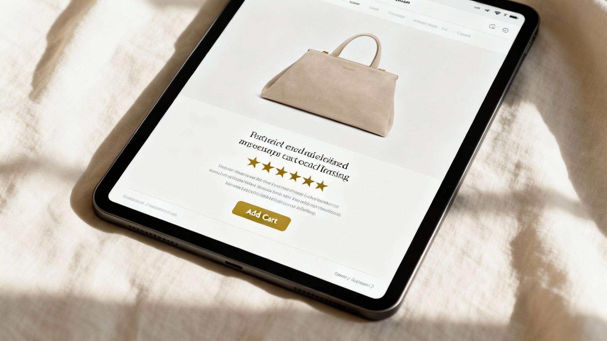
Design Product Pages That Build Confidence
Your product page is the final pitch. It's the make-or-break moment where a casual browser becomes a committed buyer—but only if you give them every piece of information they need to feel confident. This is your chance to answer every question and squash every objection before it even pops into their head.
A high-converting product page is a careful blend of compelling visuals, persuasive copy, and undeniable social proof.
- High-Quality Visuals: Don't just show pictures; tell a story. You need multiple high-resolution images from every angle, in-context photos showing the product in use, and even short videos. Let shoppers zoom in and see the stitching.
- Persuasive Descriptions: Go way beyond just listing features. You need to focus on the benefits—how does this product solve a problem or make the customer's life better? Use crisp bullet points to make key features scannable.
- Authentic Social Proof: Customer reviews are non-negotiable. Displaying ratings and reviews prominently builds trust and provides unbiased validation from real people. Done right, showcasing reviews can boost conversions by as much as 270%.
By nailing these core UX elements—navigation, search, and product pages—you create a seamless path to purchase. This frictionless journey doesn't just increase conversion rates; it builds the kind of brand trust that brings customers back again and again.
Designing a Frictionless Checkout Flow

You’ve done all the heavy lifting. You've built a beautiful site, written compelling product descriptions, and successfully guided shoppers all the way to the cart. Now comes the moment of truth: the checkout. This is where a browser becomes a buyer, but it's also where an astonishing number of sales simply fall apart.
The average cart abandonment rate hangs around a painful 70%. Let that sink in. Seven out of every ten people who wanted your product enough to add it to their cart will leave without paying. The main culprit, almost every time, is a clunky, confusing, or untrustworthy checkout process.
Every extra field they have to fill out, every unexpected fee, every moment of hesitation is another reason for them to click away. Designing a frictionless checkout isn't a minor tweak; it’s one of the most powerful levers you can pull to boost your store's conversion rate. The goal is to make paying so easy it feels automatic.
Simplify and Streamline Every Step
Complexity is the arch-nemesis of conversion. Once a customer has made the decision to buy, your job is to get out of their way. A long, intimidating form is a surefire way to introduce doubt and make them reconsider.
Take a hard, honest look at your current checkout form. Do you really need their phone number if you only send email confirmations? Can you combine "First Name" and "Last Name" into a single "Full Name" field? Every single field you can eliminate is a win.
It’s a classic story, but it bears repeating: Expedia famously increased its annual profits by $12 million just by removing one optional form field from their checkout page. This proves that even the smallest bit of friction can have massive financial consequences.
A great way to reduce the mental load on your customers is to break the process into smaller, logical chunks. A multi-step checkout with a clear progress bar (e.g., Shipping > Payment > Review) feels far less overwhelming than one giant page of forms. It guides the user forward and shows them exactly how close they are to the finish line.
Eliminate Surprises and Build Trust
The second-biggest conversion killer at checkout? The last-minute surprise. Nothing sours a deal faster than an unexpected shipping cost or a mandatory "Create an Account" prompt popping up just before the final click. Transparency is non-negotiable here.
Here’s how to build the trust needed to get customers across the line:
- Offer Guest Checkout: Forcing users to create an account is a massive barrier. Data consistently shows that offering a guest checkout option can immediately boost conversions by 10-30%. You can always invite them to create an account on the "Thank You" page after the sale is locked in.
- Be Upfront with Costs: Show all costs—including shipping, taxes, and any fees—as early as you possibly can. A shipping cost calculator in the shopping cart is a fantastic tool for managing expectations and preventing sticker shock on the final payment page.
- Display Security Badges: Prominently feature logos from your secure payment processors and SSL certificates. These are simple visual cues that reassure customers their financial information is safe, which is always a top concern for online shoppers.
These elements work together to create an environment of trust and clarity, removing the final doubts that often lead to abandoned carts.
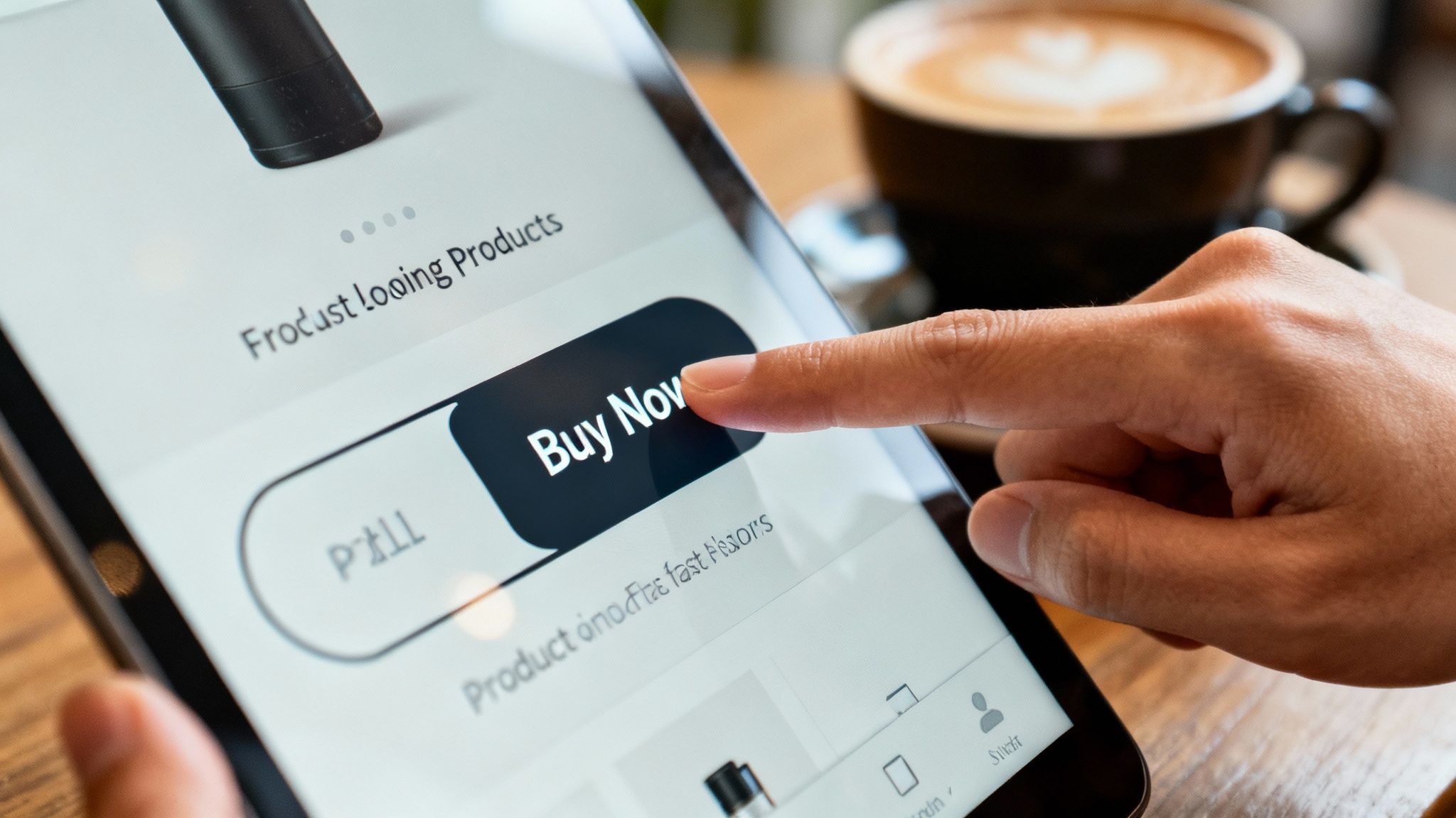
Optimize for Speed and Efficiency
In the final moments of a purchase, speed is everything. Modern shoppers expect things to happen instantly, and that absolutely includes the payment process. One-click checkouts for returning customers and express payment options are no longer just nice-to-haves; they are essential for maximizing conversions.
Integrating wallet-based payment options is a powerful way to accelerate the final step. When customers can pay directly from a digital wallet, they get to skip the tedious process of manually typing in card numbers, expiry dates, and billing addresses.
For instance, accepting Bitcoin through a service like Flash enables wallet-to-wallet transactions that are both instant and secure. This not only appeals to a growing global audience of Bitcoin users but also drastically simplifies the payment step, reducing the opportunity for typos or second thoughts. The fewer clicks and keystrokes required, the higher your odds of closing the sale.
Ultimately, a well-designed checkout flow is a silent revenue driver. By simplifying forms, being transparent about costs, and offering fast, modern payment methods, you dismantle the barriers that cause shoppers to hesitate. This final optimization is critical, as data highlights that stores with streamlined checkouts are far more likely to surpass the average ecommerce conversion rate of 2.5% to 3% and join the ranks of high-performing brands. You can learn more about how checkout optimizations impact these ecommerce conversion rate benchmarks and drive growth.
Expanding Payment Options for a Global Audience
You’ve done everything right. A customer loves your product, trusts your brand, and has already filled out their shipping details. They’re ready to buy.
Then, they hit the payment page, and their preferred method isn't there. Just like that, the sale evaporates. It’s a painfully common scenario that points to a massive opportunity many merchants are still missing: payment flexibility.
In a global market, assuming everyone defaults to a credit card is an expensive mistake. Shoppers have wildly different preferences, from digital wallets to local payment methods and, increasingly, Bitcoin. Refusing to accommodate them is like closing your door to entire countries and demographics.
The Power of Choice at Checkout
Offering multiple ways to pay is one of the most direct and effective ways to boost your e-commerce conversion rates. When a customer sees a familiar, trusted payment option, it instantly removes a huge point of friction and builds confidence at the most critical moment.
This isn't just about adding one or two digital wallets. It’s about understanding that how people pay is deeply tied to their geography, age, and comfort with technology. For a growing, tech-forward audience, that preference is often Bitcoin.
Offering a variety of payment methods isn't just a convenience—it's a powerful trust signal. It shows you're a serious, global business that respects customer choice, which can dramatically reduce checkout hesitation and cart abandonment.
When you don't offer diverse payment gateways, you're not just losing a single transaction. You're potentially losing a customer who may never come back. On the flip side, every additional payment option you support is another potential "yes" at the final step of the buying journey.
Why Accepting Bitcoin Is a Strategic Advantage
Integrating Bitcoin payments is more than just adding another icon at checkout. It's a strategic move that plugs you into a specific and valuable customer base. This isn’t about chasing a trend; it's about recognizing that hundreds of millions of people worldwide hold and use Bitcoin for its unique advantages.
For your business, this translates into some clear benefits:
- Access a New Market: You immediately appeal to a global community of Bitcoin users who actively look for merchants that support their currency of choice. Many of these potential customers face hurdles with traditional banking and are incredibly loyal to brands that cater to them.
- Slash Transaction Fees: Forget the 2-3% fees that credit card processors skim off the top. Bitcoin transactions can be far more cost-effective, which means more revenue stays in your pocket.
- Eliminate Chargebacks: Bitcoin transactions are final. This completely removes the risk of fraudulent chargebacks—a common and costly headache for e-commerce merchants that drains profits and creates administrative nightmares.
By offering Bitcoin, you signal that your brand is modern, secure, and ready for a global stage.
Making Bitcoin Payments Simple and Secure
For many merchants, the thought of accepting Bitcoin sounds complicated. But modern solutions have made the process incredibly simple. The key is using a payment gateway that handles all the technical heavy lifting for you.
A service like Flash, for example, enables direct wallet-to-wallet transactions without ever taking custody of your funds. This decentralized approach means payments are instant, secure, and private.
Here’s what that looks like for your customer in the real world:
- Select Bitcoin at Checkout: They simply choose the Bitcoin payment option on your site.
- Scan a QR Code: A unique QR code pops up. They scan it with their Bitcoin wallet app.
- Confirm the Transaction: They approve the payment from their wallet, and it's done in seconds.
The process is frictionless for the customer and requires no complex setup on your part. It’s a straightforward, secure way to open your store to a massive new audience, cut operational costs, and stop losing sales to a missing payment option ever again.
Optimizing for a Mobile-First World
Let's be blunt: your customers are on their phones. What was once a channel for casual browsing has exploded into the primary place people make purchases. A clunky or slow mobile site isn't just a minor annoyance anymore—it's a direct path to lost sales and a tarnished reputation.
Having a "responsive" site that just shrinks to fit a phone screen is table stakes. To really move the needle on conversions, your mobile experience needs to feel like it was born on a phone. The goal is simple: make buying from you on mobile faster and easier than it is on a desktop.
Speed Is the Foundation of Mobile Conversion
Every single second counts on mobile. Your customers are on the go, often dealing with spotty cell service, and have absolutely zero patience for a site that lags. The data is crystal clear: a delay of even one second in page load time can send your conversion rates off a cliff.
This isn't just some technical jargon for your developers to worry about. It's a business problem with a direct impact on your revenue. Slow-loading images, bloated code, and aggressive pop-ups are killers for the mobile experience. Prioritizing site speed is a core business strategy, period.
Design for Thumbs, Not Cursors
Desktop sites are built for the pinpoint precision of a mouse cursor. Mobile sites are navigated with clumsy thumbs. This fundamental difference needs to drive every single design decision you make. If a customer has to pinch and zoom just to click a button, you've already lost.
Think about these thumb-friendly design principles:
- Big, Tappable Buttons: Make your CTAs large enough that they're impossible to miss or accidentally tap something else nearby.
- Simple Navigation: Keep your menu clean and focused. A classic "hamburger" menu works well. Don't overwhelm people with dozens of choices.
- Generous Spacing: White space is your best friend. Give clickable elements room to breathe to prevent frustrating mis-taps.
Your mobile checkout should be so smooth a person can complete it with one hand while holding a coffee. If it requires two hands and intense concentration, it's too complicated.
This mindset goes beyond just buttons. Forms need to be stripped down to the absolute essentials. Your site should also be smart enough to bring up the right keyboard—like a number pad for a phone number field. Every interaction has to feel effortless.
The Undeniable Rise of M-Commerce
The move to mobile isn't a trend; it's a complete rewiring of how people shop. Mobile commerce, or M-commerce, is reshaping everything we know about conversion. Recent data shows that over 75% of retail site visits worldwide now come from smartphones, driving about two-thirds of all online orders.
This dominance means optimizing for mobile isn't optional anymore. Stores built for seamless navigation, instant loading, and mobile-native payments are the ones that will win. You can dig into more of the data on how mobile behavior is shaping global conversion benchmarks on Statista.com.
When you truly prioritize a mobile-first design, you’re not just catering to a segment of your audience—you’re optimizing for the vast majority. The first step to turning all that mobile traffic into actual revenue is treating the mobile experience as the main event, not an afterthought.
Your Top Ecommerce Conversion Questions, Answered
Once you start digging into conversion optimization, a lot of questions come up. We've covered the core strategies—tweaking your user experience, smoothing out the checkout flow, and adding new payment options. Now, let's tackle the questions I hear most often from merchants.
Here are some straight answers to help you make smarter, data-driven decisions for your store.
What Is a Good Ecommerce Conversion Rate?
This is easily one of the most misunderstood metrics out there. Everyone wants to know the magic number. While you'll hear stats thrown around that the global average is between 2-4%, that number is practically useless without context.
The real question is, "What's a good rate for my business?"
A high-end furniture store could be wildly successful with a 1.5% conversion rate because their average order value is massive. On the other hand, a shop selling cheap phone cases probably needs to hit 5% or more just to stay afloat. The only benchmark that truly matters is your own history.
Your goal isn't to beat some generic industry average. It's to beat your own performance from last month. Focus on steady, incremental improvements, because that's what actually moves the needle on your revenue.
This mindset shift ensures you're chasing real progress that directly impacts your bank account.
What's the Fastest Way to Improve Conversions?
If you're looking for the biggest impact in the shortest amount of time, zero in on your checkout process. This is the lowest-hanging fruit, bar none. Why? Because anyone who makes it this far already wants to buy your product. Don't give them a reason to change their mind.
Any friction here is a direct hit to your sales.
For an immediate lift, focus on these three things:
- Offer Guest Checkout: Forcing someone to create an account is a notorious conversion killer. Let people buy without the commitment.
- Slash Unnecessary Form Fields: Every single field is another opportunity for a customer to get frustrated and leave. Be ruthless. If you don't absolutely need that information to fulfill the order, get rid of it.
- Show the Full Cost Upfront: Nobody likes surprises, especially when it comes to money. Hidden shipping fees and taxes are the #1 reason for cart abandonment. Be transparent from the start.
Fixing these seemingly small issues can give you a noticeable boost in completed sales almost overnight.
Why Should I Accept Bitcoin If My Customers Use Credit Cards?
Thinking about Bitcoin as just another payment button misses the point entirely. It's a strategic move to tap into a very specific, high-value, and largely ignored customer base. You're not trying to replace credit cards; you're expanding your market.
Bitcoin users are a global community that values privacy, security, and financial autonomy. They might be locked out of traditional banking or simply prefer the directness of peer-to-peer payments. By adding Bitcoin, you’re sending a clear signal: your brand is modern, global, and forward-thinking.
This isn't about catering to a tiny fraction of your existing audience. It's about opening a door for a dedicated niche that most of your competitors haven't even thought about, creating a brand new revenue stream in the process.
How Do I Know Which Changes Are Actually Helping?
Simple: You test. The only way to know for sure if your changes are working is with rigorous A/B testing. Gut feelings and assumptions have no place here. Making changes based on what you think will work is a great way to waste a lot of time and money.
A/B testing (or split testing) lets you make decisions based on what your customers actually do, not what you guess they'll do.
The process is pretty straightforward:
- You create two versions of a page—let's call them A and B. The only difference might be the headline, the color of your "Buy Now" button, or the main product image.
- Using a testing tool, you show Version A to half of your visitors and Version B to the other half.
- The tool tracks everything and tells you, with statistical confidence, which version got more people to convert.
This data-backed approach takes the guesswork out of optimization. It ensures that every single change you make is a proven step towards a better conversion rate.
Ready to unlock a global customer base and slash your transaction fees? With Flash, you can start accepting secure, instant Bitcoin payments in under a minute. Our decentralized, wallet-to-wallet solution requires no coding and eliminates chargebacks for good. See how easy it is to grow your business at .